Decameron Hotels:
Multinet

OVERVIEW

Multinet is an internal platform for Decameron Hotels used by employees with access permissions. This system allows the user to perform user inquiries, contracts generation, reservation requests, show room attendance, among other tasks. Its interfaces are forms that employees must fill out daily to consult or record information.

MY ROLE

I was in charge of creating the user flows and wireframes. Also participated in all the workshops, designed and conducted the user testing sessions and collaborated in the final design of the user interfaces. I collaborated with a Product Manager and the Development Team.
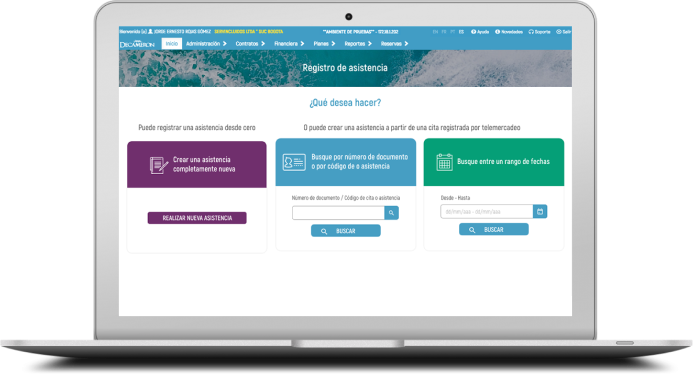
*The redesign process for “Multinet” was carried out in collaboration with Aguayo for Decameron Hotels.

PROJECT DETAILS

Client

Decameron Hotels

Categories

UX Research
UX Design
Information Arquitecture
UI Design

Duration

6 Months

Main Insights

The platform was not user friendly; there was a high level of frustration while performing tasks, it did not have a clear information architecture and therefore its navigation and interaction was confusing and slow.

The Challenge

To improve the Multinet user experience and specifically, optimize the times for carrying out specific tasks within the platform.

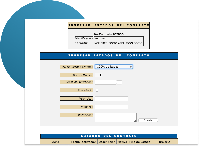
THE OLD MULTINET – CONTRACT FORM PAGE

Multinet form before the redesign.

Involving Stakeholders

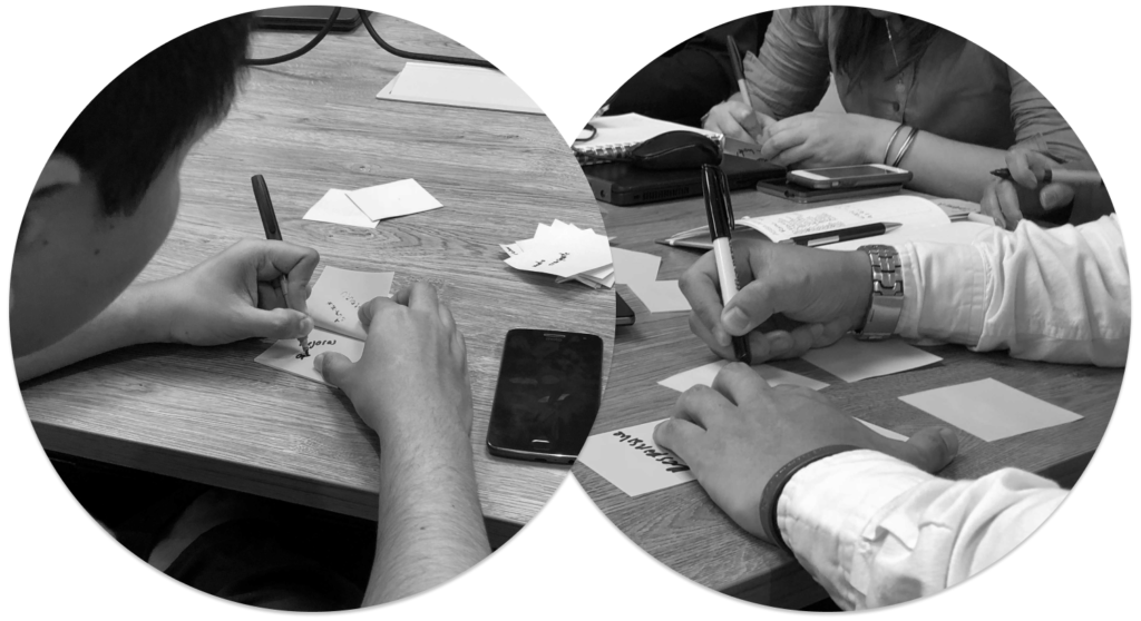
The redesign of Multinet was a good opportunity for customers to learn more about their employees: their profiles, motivations and pains. For this reason, we decided to integrate them into the process, involving them in various workshops and activities that allowed them to find a balance between their expectations and their employees/users needs.

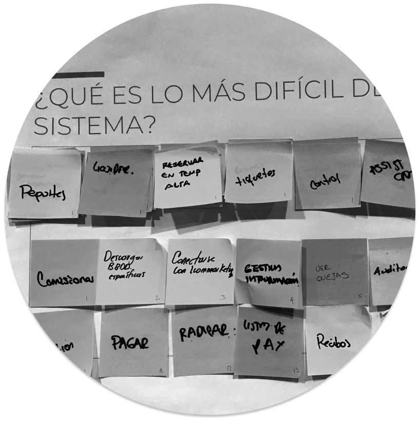
KJ Methodology

This tool allowed us to identify specific expectations our client had regarding the new design for Multinet.

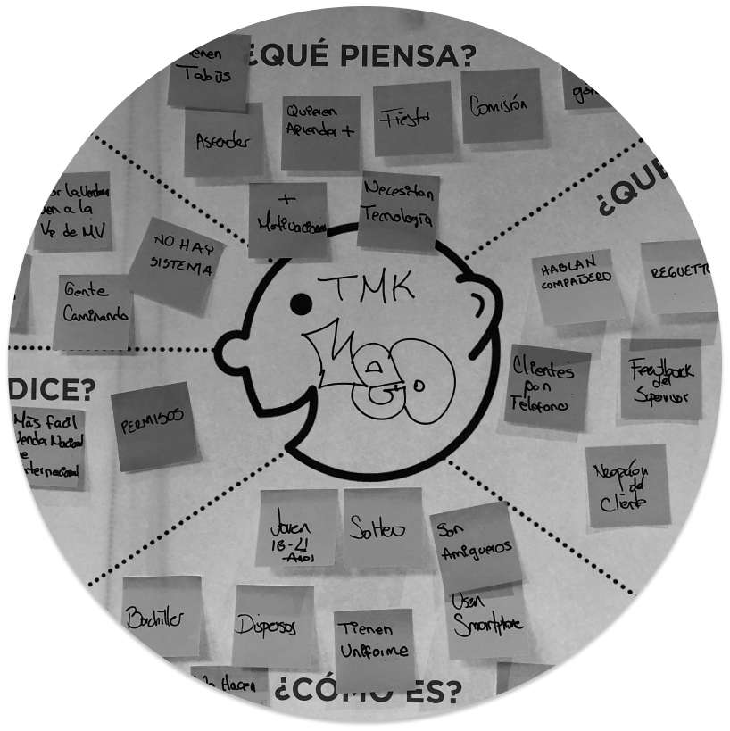
Empathy Maps and Storytelling Boards

Clients “put themselves into their employees’ shoes”. This activity was useful for the customers to identify the profile of the users.

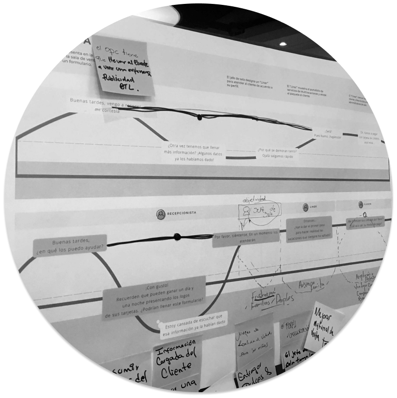
Journey Mapping – The Ideal Experience

By realizing the most critical moments in the experience of their employees, the customer had the opportunity to propose improvements.


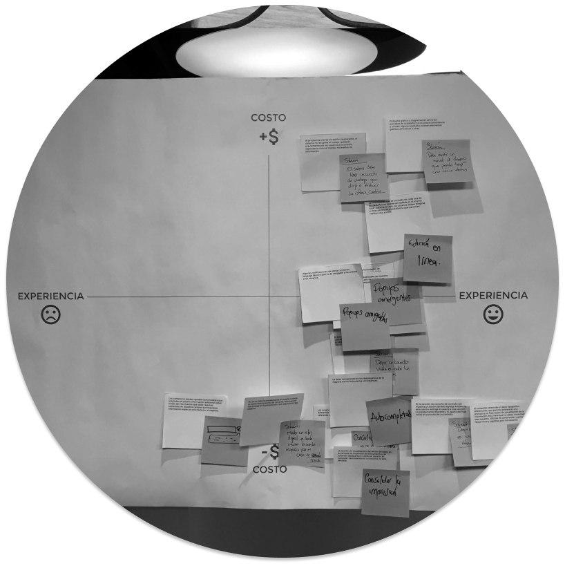
Prioritization of Issues

In a grid, the client could obtain a general idea of the investment that should be made for the implementation of certain improvements in the platform. This allowed a prioritization of these improvements based on their limits in terms of budget and time.

Listening to the users: Field Trips

Through interviews with users, notes, photos, audios and video recordings, we were able to identify the most common difficulties while using the platform in a real context. We observed that the main issue negatively impacting the user experience of Multinet was a mix between the difficulty of generating contracts using the platform (performance issues, visual saturation and high cognitive load) and the fact that users were usually doing many other tasks simultaneously (talking with their customers, filling out reports, answering questions from other colleagues). All these aspects usually caused high-level stress and caused a lack of effectiveness in their time and performance.

Analyzing the current user experience (Journey Map)

The issues found in the field, served as a basis to create a journey map of the current experience in order to have a better understanding of the difficulties users had while using Multinet as well as their feelings and moments of frustration. Later on, this journey map was an input to create another one which would reflect the ideal experience for the platform.

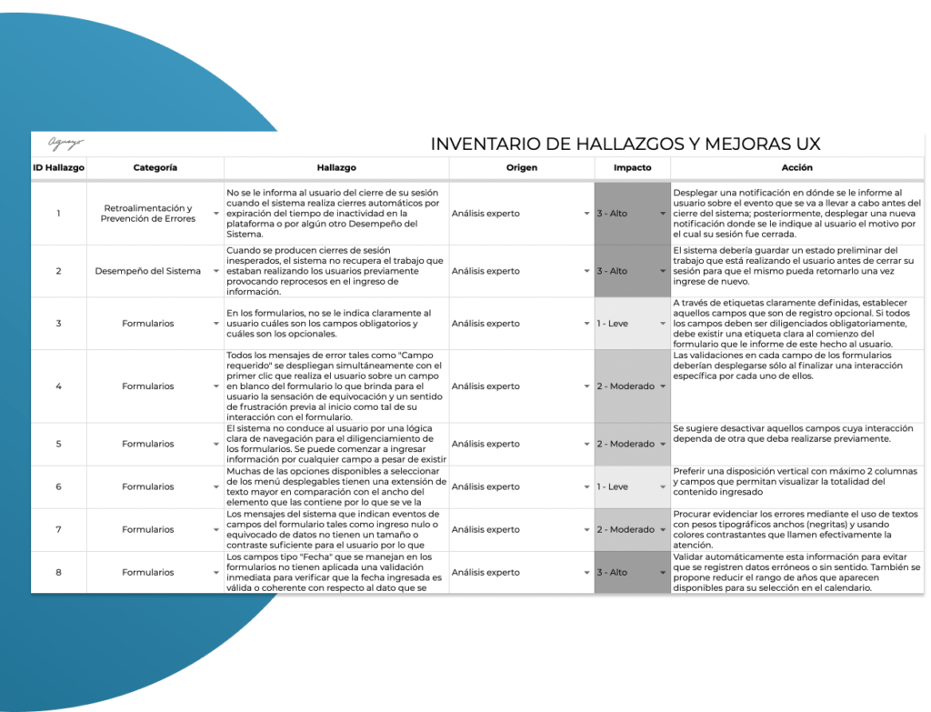
Evaluating the Usability of Multinet: Jakob Nielsen's Heuristic Evaluation

A list of usability issues was made to compare them with the 10 heuristics proposed by Jakob Nielsen.  By doing this, we could determine the degree of usability that Multinet had at that time and also start thinking about possible solutions to improve the user experience.

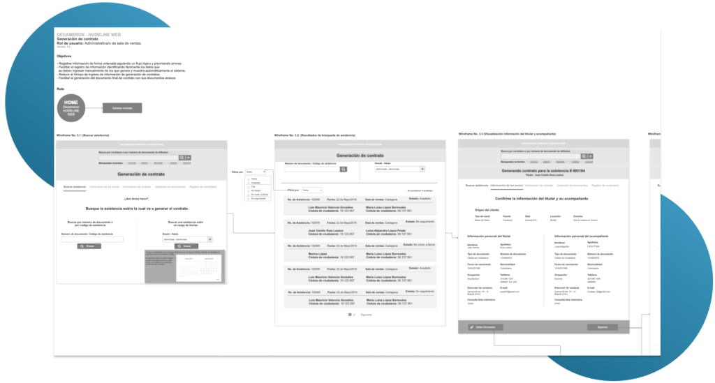
Designing the new multinet: Wireframes and User Flows

With the consolidation of usability issues, we started with the creation of user flows and wireframes in which we proposed a new way of interacting with the platform.

Software: Axure.

Testing our design proposal: USER TESTING

Through a prototype, a test was carried out in the field with real users to evaluate the flow and the proposed designs, obtaining as a general result a positive perception of the redesign with minimal adjustments to be made.

Total number of users: 5.
Number of tasks in protocol: 7 – 8 approximately.
Approximate time per session: 20 – 30 minutes.
Software used: Screencast Plugin, Quicktime and ProtoIO for prototyping.

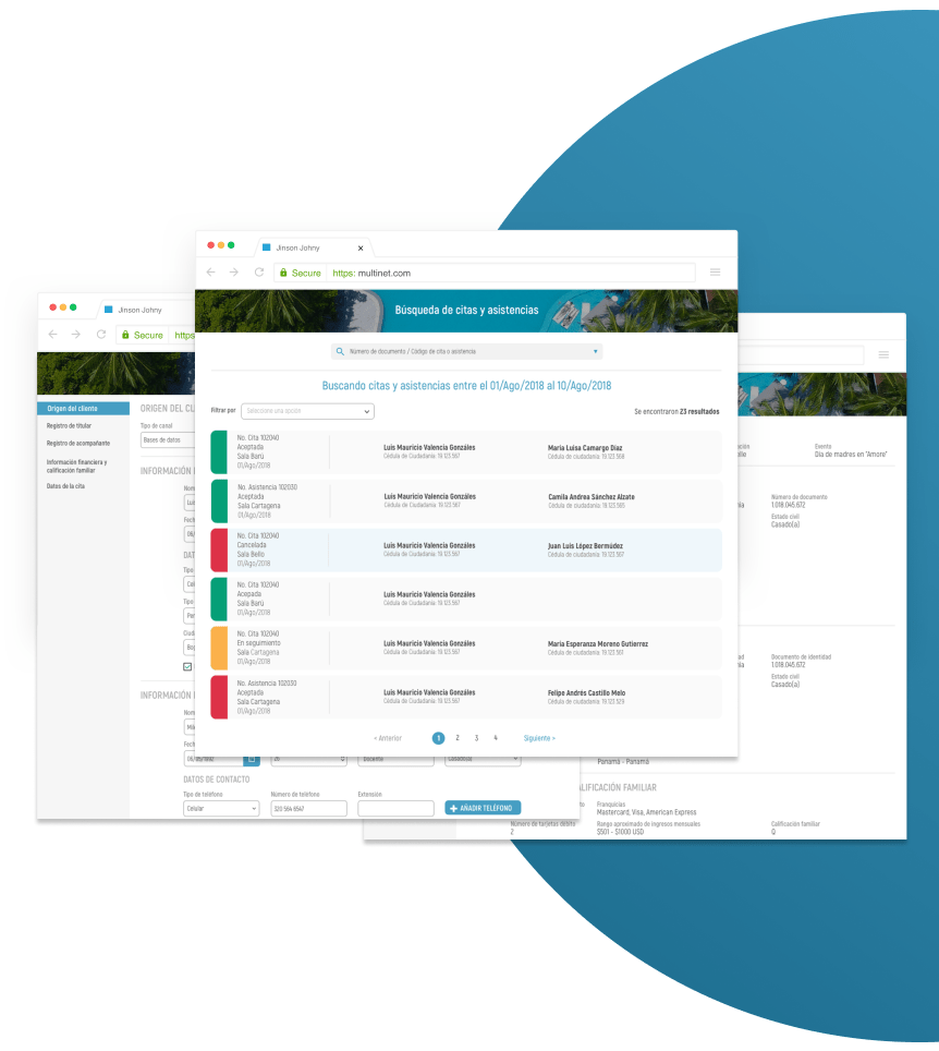
Consolidating a New Design for Multinet

A new design for Multinet was consolidated, improving the usability of the platform. This also improved the user experience and therefore, the performance in the interaction.The most important changes were made at the information architecture and interface level, allowing an easier and simpler navigation reducing the cognitive load and the level of visual exhaustion.